Color psychology is the study of how different colors affect human emotions, behaviors, and mental states. For example, when you enter a room painted in soft blues, you probably feel more relaxed compared to when you walk into a space filled with bright reds. This isn’t just a coincidence—it’s science influencing your home environment.
The colors you see every day have a significant impact on your mood and wellness. The sage green walls in your bedroom might be why you sleep better, while the cheerful yellow kitchen could explain why you feel more energized in the mornings. By understanding how color psychology affects mood and wellness at home, you can make deliberate design choices that support your emotional well-being.
But it’s not only about colors; other factors like staying properly hydrated also play a vital role in your overall health and wellness. For instance, using the right color scheme can turn your living space from just functional to beneficial for therapy. When you understand how specific colors evoke psychological reactions, you can create spaces that help you relax, boost your productivity, or foster social connections.
Additionally, learning about nutrition during menopause can further improve your well-being during this transitional period. Your home is more than just a place to live—it becomes a thoughtfully designed sanctuary that enhances your daily life and mental health.
The Science Behind Color Psychology
How Your Brain Processes Color
Your brain processes color information through complex neural pathways that directly influence your emotional response to colors and subsequent behavioral patterns. When light enters your eyes, specialized cells called cones detect different wavelengths and transmit signals to the limbic system – the brain’s emotional control center. This biological process explains why certain hues can instantly shift your mood or energy levels.
Colors and Human Behavior
Research in neuroscience reveals that colors trigger measurable changes in human behavior through hormone production and neurotransmitter activity. Blue wavelengths, for instance, suppress melatonin production during daylight hours while promoting its release in evening environments. Red stimulates the sympathetic nervous system, increasing heart rate and blood pressure, which explains its association with urgency and excitement.
Colors and Health Choices
Interestingly, these color-induced changes can also intersect with our health and wellness choices. For example, prolonged exposure to specific color environments can alter stress hormone levels, cognitive performance, and emotional stability. Cool colors like green and blue activate the parasympathetic nervous system, promoting relaxation and recovery. This is particularly relevant when considering therapeutic approaches like ketamine for anxiety, where relaxation plays a key role in treatment efficacy.
Colors and Mental Well-Being
The psychological impact extends beyond immediate reactions to influence long-term mental well-being. Studies demonstrate that warm colors such as yellow and orange stimulate dopamine production, enhancing feelings of happiness and motivation. However, it’s essential to note that these effects can be complex. For instance, while some might find comfort in certain food colors, others might be influenced by nutritional myths that skew their perception of what constitutes healthy eating.
Cultural Influence on Color Perception
Cultural conditioning also shapes color perception, though biological responses remain remarkably consistent across populations. Your personal associations with specific hues – formed through experiences and memories – layer additional meaning onto these fundamental neurological reactions, creating your unique color psychology profile.
Potential Risks with Medications
Additionally, it’s crucial to be aware of potential risks associated with certain medications like Ozempic. While effective for managing Type 2 diabetes, it’s important to understand its gastrointestinal side effects or its safety during pregnancy, as these factors can further complicate one’s mental well-being and overall health.
Using Colors to Create Desired Moods at Home
Mood enhancement with colors requires strategic planning that goes beyond simple aesthetic preferences. You need to consider the primary function of each space and the emotional atmosphere you want to cultivate. A bedroom designed for rest demands different color choices than a home office where you need sustained focus and productivity.
Emotional balance at home starts with understanding your daily routines and identifying where specific moods would benefit your well-being. Your morning coffee ritual in the kitchen might benefit from energizing yellows or warm oranges, while your evening wind-down routine calls for the calming influence of soft blues or gentle greens.
Practical Color Selection Strategies
When selecting colors for mood enhancement, you should:
- Match colors to activities – Choose energizing hues for active spaces and calming tones for relaxation areas
- Consider natural light exposure – Rooms with abundant sunlight can handle cooler blues and greens, while darker spaces benefit from warmer yellows and oranges
- Layer complementary shades – Use a dominant color with supporting accent tones to create depth without overwhelming the senses
- Test before committing – Paint small sections or use removable samples to observe how colors affect your mood throughout different times of day
The 60-30-10 rule provides an excellent framework for color distribution: 60% dominant neutral, 30% secondary color, and 10% bold accent. This approach prevents color fatigue while ensuring your chosen hues deliver their intended psychological benefits.
Remember that personal associations with colors can override general psychological principles, so trust your instinctive responses when making final decisions.
In addition to these strategies, it’s important to consider how our physical health can influence our mental state and overall mood. For instance, understanding the differences between medications like Jardiance and Ozempic, which are used in diabetes management, could provide insights into how we can manage our health better.
Moreover, during seasonal changes, our immunity can be affected. It’s beneficial to explore proven ways to boost immunity during these times through diet and lifestyle adjustments.
It’s also vital to recognize that mental health issues such as depression can lead to a lack of appetite, which may impact our overall well-being.
Lastly, as we age, we might need to adapt our physical activities for better joint health. Therefore, exploring workout adaptations for joint health as you age could be beneficial in maintaining a healthy lifestyle.
Color Psychology in Action: Room-by-Room Guide
Understanding How Color Psychology Influences Mood and Wellness at Home requires strategic implementation of room-specific color strategies tailored to each space’s unique function and purpose.
Bedrooms: Your Personal Sanctuary
Create a restful retreat with soft blues, gentle greens, or warm neutrals like cream and beige. These colors naturally lower heart rate and promote deeper sleep. You can introduce lavender accents through bedding or wall art to enhance relaxation. Avoid bright reds or vibrant oranges in sleeping areas, as these energizing hues can disrupt your natural circadian rhythms. If sleep issues persist, consider exploring weight management medications that could help improve overall health and wellness.
Living Rooms: Social Connection Hubs
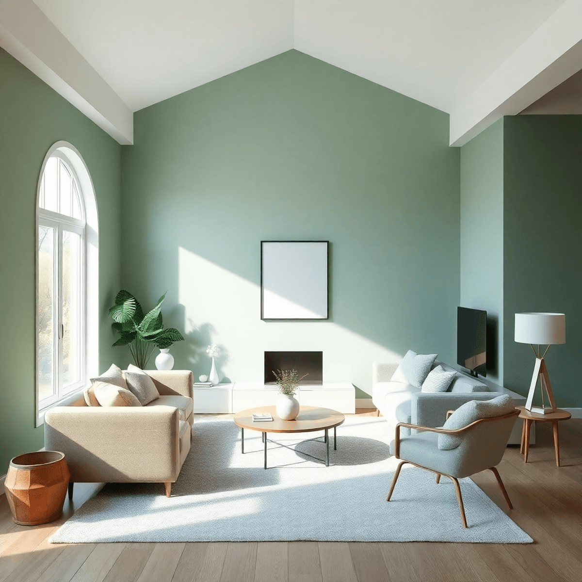
Design welcoming spaces using warm earth tones like terracotta, sage green, or soft yellows. These colors encourage conversation and create inviting atmospheres for family gatherings. You might combine a neutral base with colorful accent pillows or artwork to maintain flexibility while establishing the desired color-driven ambiance.
Kitchens: Energy and Nourishment Centers
Incorporate appetite-stimulating colors such as warm oranges, sunny yellows, or rich reds through backsplashes, cabinet hardware, or decorative elements. White or light gray cabinets provide clean, fresh foundations while allowing colorful accents to energize the space without overwhelming it. It’s also crucial to maintain a healthy diet in this energy center of your home; for those managing diabetes, check out this ultimate guide on healthy snacks that could assist you.
Home Offices: Focus and Productivity Zones
Select colors that enhance concentration and creativity. Light blues promote clear thinking, while green reduces eye strain during long work sessions. You can add purple accents to stimulate innovative thinking or use crisp whites to create clean, organized environments that support mental clarity.
Bathrooms: Personal Wellness Retreats
Transform these spaces into spa-like sanctuaries using calming blues, soft greens, or pristine whites. These colors promote cleanliness and tranquility, turning daily routines into mindful wellness practices. Natural stone colors or seafoam greens can create connections to nature’s restorative qualities. To further enhance your bathroom experience into a personal wellness retreat, consider incorporating some of the [latest breakthroughs in skincare technology](https://wellnesshq.net/skin-care-beauty/transform-your-routine-the-latest-breakthroughs-in-skincare-technology) into your routine.
Each room benefits from intentional color choices that align with its primary function while supporting your emotional and physical well-being throughout your daily routines.
Beyond Aesthetics: The Therapeutic Benefits of Color at Home
Color therapy extends far beyond simple decoration, offering genuine mental health benefits of color therapy that can transform your living space into a healing sanctuary. Scientific research demonstrates that specific hues trigger measurable physiological responses in your body, influencing hormone production, heart rate, and brain activity patterns.
The Healing Power of Colors
1. Blue Environments
Blue environments naturally lower cortisol levels, your body’s primary stress hormone, while simultaneously reducing blood pressure and promoting deeper sleep cycles. You can harness this therapeutic power by incorporating soft blue tones in spaces where you unwind after challenging days. For instance, these soothing blue shades can significantly enhance your sleep quality, creating a more restful environment.
2. Green Hues
Green hues activate the parasympathetic nervous system, creating an immediate sense of balance and restoration. This color mimics nature’s calming influence, making it particularly effective for home offices or meditation corners where mental clarity is essential. Such spaces can also benefit from mind-body approaches to managing chronic pain, providing a holistic approach to wellness.
3. White and Cream Tones
White and cream tones serve as powerful mood elevators, especially beneficial for individuals experiencing seasonal depression or anxiety. These colors reflect maximum light, creating an uplifting atmosphere that combats feelings of heaviness or confinement.
How to Use Colors for Healing
You can strategically place therapeutic colors through:
- Accent walls in calming blues or greens
- Textiles and artwork featuring mood-boosting yellows
- Lighting choices that enhance color temperature
- Natural elements like plants that introduce healing greens
The key lies in understanding your personal emotional needs and selecting colors that address specific mental wellness goals rather than following generic design trends. Moreover, pairing these color strategies with lifestyle changes such as a 96-hour fast for weight loss management could further enhance your overall well-being.
Designing for Productivity and Creativity with Color Psychology
The colors in your workspace have a direct impact on how well you think and how creative you are. Colors that boost productivity, such as light blue, can improve mental clarity and focus, making them ideal for home offices where you need to concentrate for long periods of time. Studies have found that blue helps stimulate the mind while also reducing mental fatigue during extended work sessions.
The Power of Green
Green is a color that strikes a perfect balance between stimulation and relaxation. It encourages innovative thinking without overwhelming your senses. You’ll find this color particularly effective in creative spaces where brainstorming and problem-solving happen frequently. The natural association with growth and renewal helps keep your mind fresh throughout challenging projects.
How to Use Color Strategically
By strategically placing colors in your workspace, you can amplify these effects:
- Yellow accents: Use small amounts of yellow to spark creativity and optimism.
- White or light neutrals: Create mental space for clear thinking by incorporating white or light neutral colors.
- Purple touches: Inspire imagination and artistic expression with hints of purple.
- Orange elements: Energize your space without the intensity of red by adding orange accents.
You can bring these colors into your workspace through various means such as painting walls, displaying artwork, choosing desk accessories, or selecting specific lighting options. Even subtle additions like colored notebooks, plants, or decorative objects can shift your mindset towards increased productivity and creative flow.
The Broader Impact of Environment
Furthermore, the influence of our surroundings goes beyond just productivity and creativity. It can also affect our emotional well-being. For example, research has shown that positive experiences during childhood, which can be nurtured through an environment often characterized by certain color schemes, play a significant role in determining long-term health outcomes like heart health. This emphasizes the deep connection between our environment, our experiences, and our overall well-being.
Practical Considerations When Choosing Colors for Your Home
Natural light plays a crucial role in how colors appear and affect your mood throughout the day. North-facing rooms receive cooler, indirect light that can make warm colors appear muted, while south-facing spaces with abundant sunlight can handle cooler tones without feeling stark. You should test paint samples on different walls and observe them at various times to see how Color Psychology Influences Mood and Wellness at Home changes with lighting conditions.
Room function directly impacts your color choices. High-traffic areas like hallways benefit from durable, forgiving colors that hide wear, while intimate spaces like bedrooms can embrace more personal, mood-enhancing hues. Consider the activities you’ll perform in each space – reading nooks need colors that reduce eye strain, while social areas can handle more stimulating palettes. This is particularly relevant when considering [the benefits of intermittent movement throughout the day](https://wellnesshq.net/mind-body-health/benefits-of-intermittent-movement-throughout-the-day-not-just-exercise), as certain colors can encourage more activity or relaxation.
Creating Cohesive Color Flow
Harmonious interior design with color psychology requires strategic planning across your entire home:
- Use a consistent undertone throughout connected spaces – warm or cool undertones create visual continuity
- Apply the 60-30-10 rule – 60% dominant neutral, 30% secondary color, 10% accent color
- Vary intensity rather than hue – use different shades of the same color family for subtle transitions
- Create visual bridges with repeated accent colors that appear in multiple rooms
You can achieve balance by selecting one primary color palette for your main living areas, then introducing complementary colors in private spaces while maintaining consistent neutral bases that tie everything together. Additionally, it may be worthwhile to consider how understanding perimenopause symptoms could influence color choices in certain rooms during this life stage.
Conclusion
Your home becomes a sanctuary when you use the power of holistic home wellness through mindful color use. Each color you choose has the ability to change your emotions, lower stress, and improve your overall well-being.
Knowing How Color Psychology Influences Mood and Wellness at Home allows you to create spaces that meet your mental and emotional needs. Whether you want the calming effect of soft blues in your bedroom or the energizing warmth of yellow in your kitchen, every color choice is a deliberate step towards a better life.
Start with small changes like decorative items or accent walls, and gradually incorporate more color into your home. Your living space should work for you, supporting your wellness journey through the simple yet powerful language of color.
FAQs (Frequently Asked Questions)
What is color psychology and why is it important in home design?
Color psychology is the study of how colors influence human emotions and behavior. In home design, understanding color psychology is essential as it helps create a harmonious living space that positively impacts mood and mental well-being.
How do different colors evoke specific emotional responses?
Colors trigger various psychological effects; for example, blue can promote calmness, red may increase energy, and green often induces relaxation. These emotional responses are linked to human behavior and mental states, making color choices crucial in influencing mood at home.
How can I use colors to enhance mood and emotional balance in my home?
Intentional color selection tailored to each area of your home can promote desired moods. For instance, warm colors like yellows and oranges can energize living spaces, while cool tones such as blues and greens foster relaxation in bedrooms. Combining colors thoughtfully enhances overall emotional balance.
What are some effective color palettes for different rooms based on color psychology?
Applying color psychology room-by-room can optimize ambiance: bedrooms benefit from soothing blues or lavenders; kitchens thrive with vibrant yellows or reds to stimulate appetite; workspaces perform well with greens or blues to boost focus and creativity; living rooms can incorporate warm neutrals for comfort.
Can incorporating certain colors at home provide therapeutic benefits for mental health?
Yes, using therapeutic hues like soft blues or greens can contribute to stress relief and improved mental wellness. Incorporating these colors into your home environment supports emotional well-being by creating calming and restorative spaces.
What practical considerations should I keep in mind when choosing colors for my home’s interior?
Consider factors such as natural light availability, room function, and desired mood when selecting colors. Achieving a balanced and cohesive look involves combining shades harmoniously across rooms while leveraging color psychology principles to support both aesthetics and wellness.